Friday, 20 November 2009
Thursday, 19 November 2009
Tuesday, 17 November 2009
Analysis of music magazine front covers taken from my moodboard
.
View more presentations from hollycranmer.
Tuesday, 10 November 2009
Friday, 6 November 2009
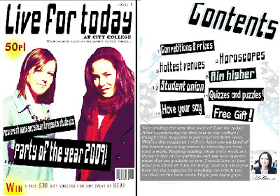
My college magazine front cover
1)I first used the magnetic lasso tool to cut out my medium close up on the two students in the chosen image for my front cover.

2)Next i added a white background and a masthead. I downloaded my font from the website www.dafont.com then enlarged it to make it stand out.

3)I also used the same font from dafont.com to use for my main cover line which I also inverted, rotated and enlarged to make it livelier.

4)I then searched on Google images for a barcode which I copy and pasted on my cover and I then added a issue number at the top using Photoshop’s fonts.

5)The next thing I did was added the price in bright red, again using Photoshop font. I put a bright yellow star behind the price by using the brushes already available on Photoshop. This was to catch peoples eye as when people see they price they will think it’s cheap and take a better look at the magazine.

6)Next I added a tagline below the masthead so people get an idea of what the magazines about.

7)At the bottom of the page I also added text advertising a competition to incise people to read to find out more. I used Photoshop’s fonts to do this and I also put it in red as it stands out more. I placed a bright yellow star behind the word ‘win’ and £30 to catch people’s eye. I made sure that when I was creating my cover that the important things were left aligned as that’s what people will see when the magazines are stacked on the shop shelves which was my intentions when positioning the price, competition at the bottom and also the main cover line.

2)Next i added a white background and a masthead. I downloaded my font from the website www.dafont.com then enlarged it to make it stand out.

3)I also used the same font from dafont.com to use for my main cover line which I also inverted, rotated and enlarged to make it livelier.

4)I then searched on Google images for a barcode which I copy and pasted on my cover and I then added a issue number at the top using Photoshop’s fonts.

5)The next thing I did was added the price in bright red, again using Photoshop font. I put a bright yellow star behind the price by using the brushes already available on Photoshop. This was to catch peoples eye as when people see they price they will think it’s cheap and take a better look at the magazine.

6)Next I added a tagline below the masthead so people get an idea of what the magazines about.

7)At the bottom of the page I also added text advertising a competition to incise people to read to find out more. I used Photoshop’s fonts to do this and I also put it in red as it stands out more. I placed a bright yellow star behind the word ‘win’ and £30 to catch people’s eye. I made sure that when I was creating my cover that the important things were left aligned as that’s what people will see when the magazines are stacked on the shop shelves which was my intentions when positioning the price, competition at the bottom and also the main cover line.


